Cafe Med Restaurant
This rebranding project reimagines a Mediterranean restaurant by aligning its identity with the symbolism of astrology. Every design element—from logo to packaging—was developed as part of a cohesive system guided by a central strategy: to blend the richness of Mediterranean culture with the cosmic intrigue of the zodiac. Through a unified aesthetic, the brand captures both tradition and modern storytelling.
Astrology was used as a story structure as the strategy basis for the rebrand. The brand identity uses astrological symbols, stars, and color schemes that are inspired by space to connect with a wider cultural interest and set the restaurant apart in a crowded market. The approach made sure that every choice in design, from fonts to colors, supported a unified story.
STRATEGY
IDENTITY
ENVIRONMENT / SIGNAGE
DIGITAL
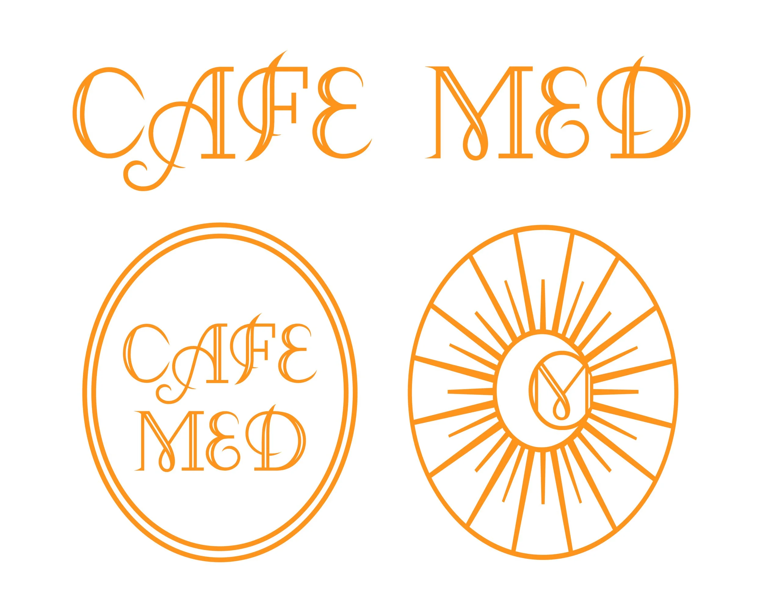

The letterforms "C" and "M" were highlighted as key structural elements. This connected the design to the name of the restaurant and kept the geometry balanced. An image of the sun was added to connect the identity to astrology and Mediterranean culture even more. This reinforced the themes of warmth, life, and the impact of the sky. When you combine typography and symbols in this way, you get a design that is both useful and full of meaning.

The brand pattern is based on zodiac constellations and turns them into a system of repeated graphics. This pattern supports the restaurant's cosmic theme and can be used in a variety of ways, such as on menus and packages. The pattern helps people remember the name and gives the design a smooth flow.

The color scheme was made to reflect the mystery of astrology while still staying true to the warm style of the Mediterranean. Deep, cosmic tones and lighter, earthy tones work together to create both contrast and harmony. This makes the color palette useful for print, digital, and outdoor uses.
The structure of the logo was inspired by astronomy, using geometric balance and symbols of the stars. Its shape establishes both authority and elegance, and it visually grounds the brand's character. As the most important part of the rebrand, the name sets the tone for everything else.


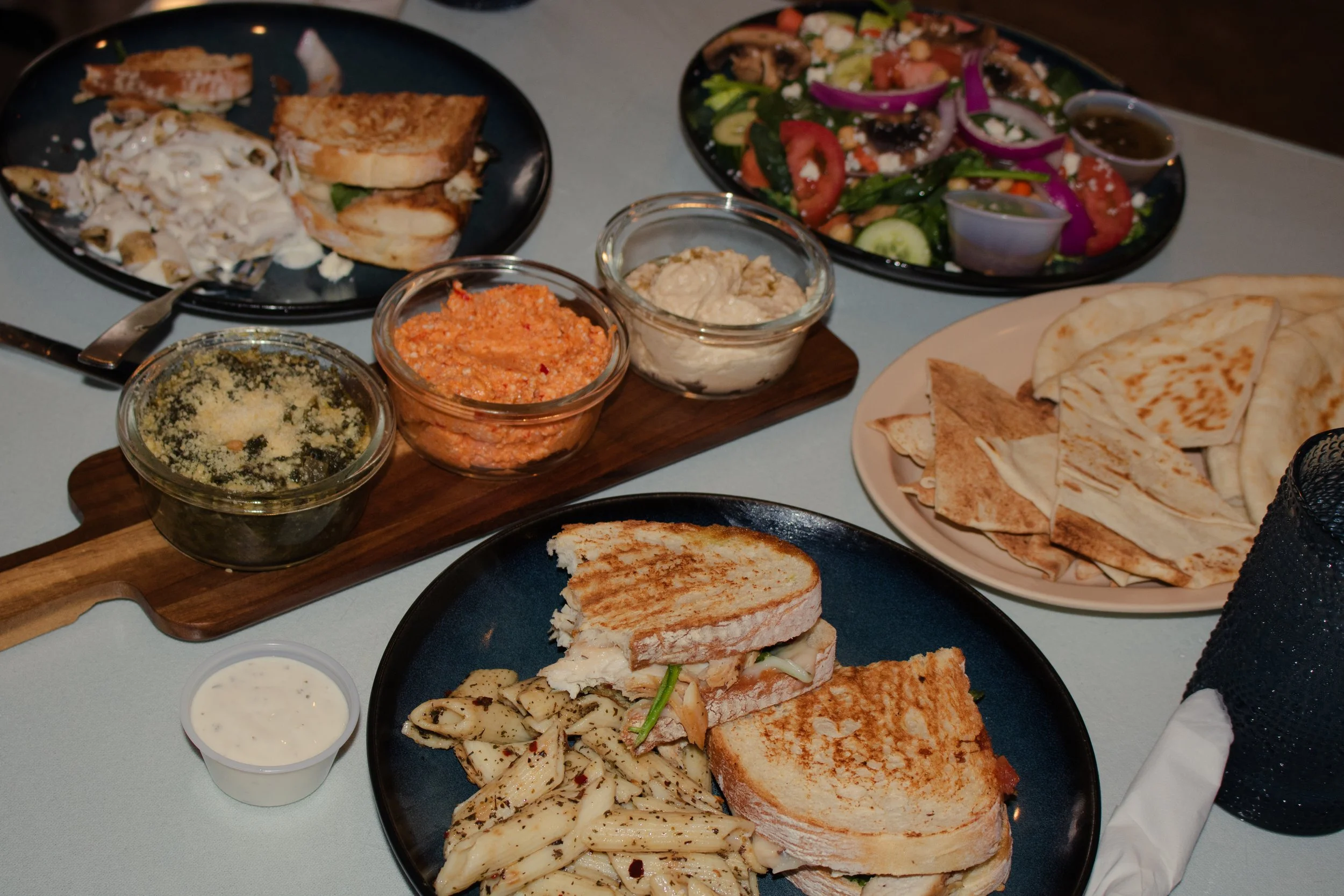
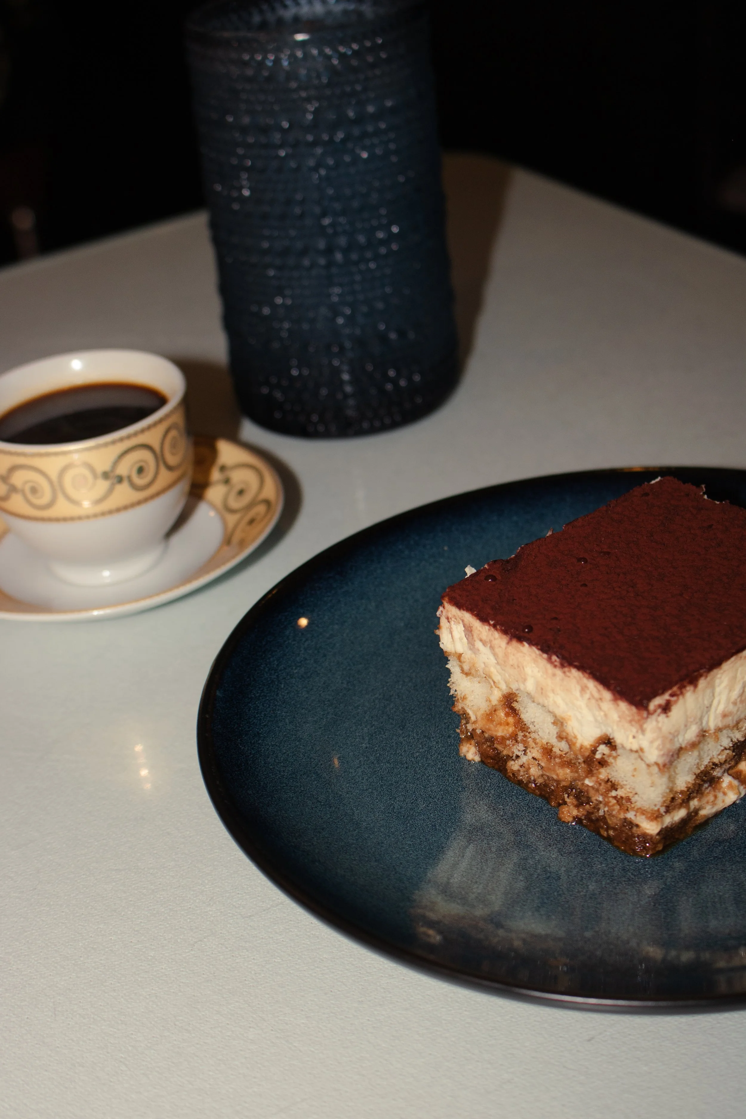
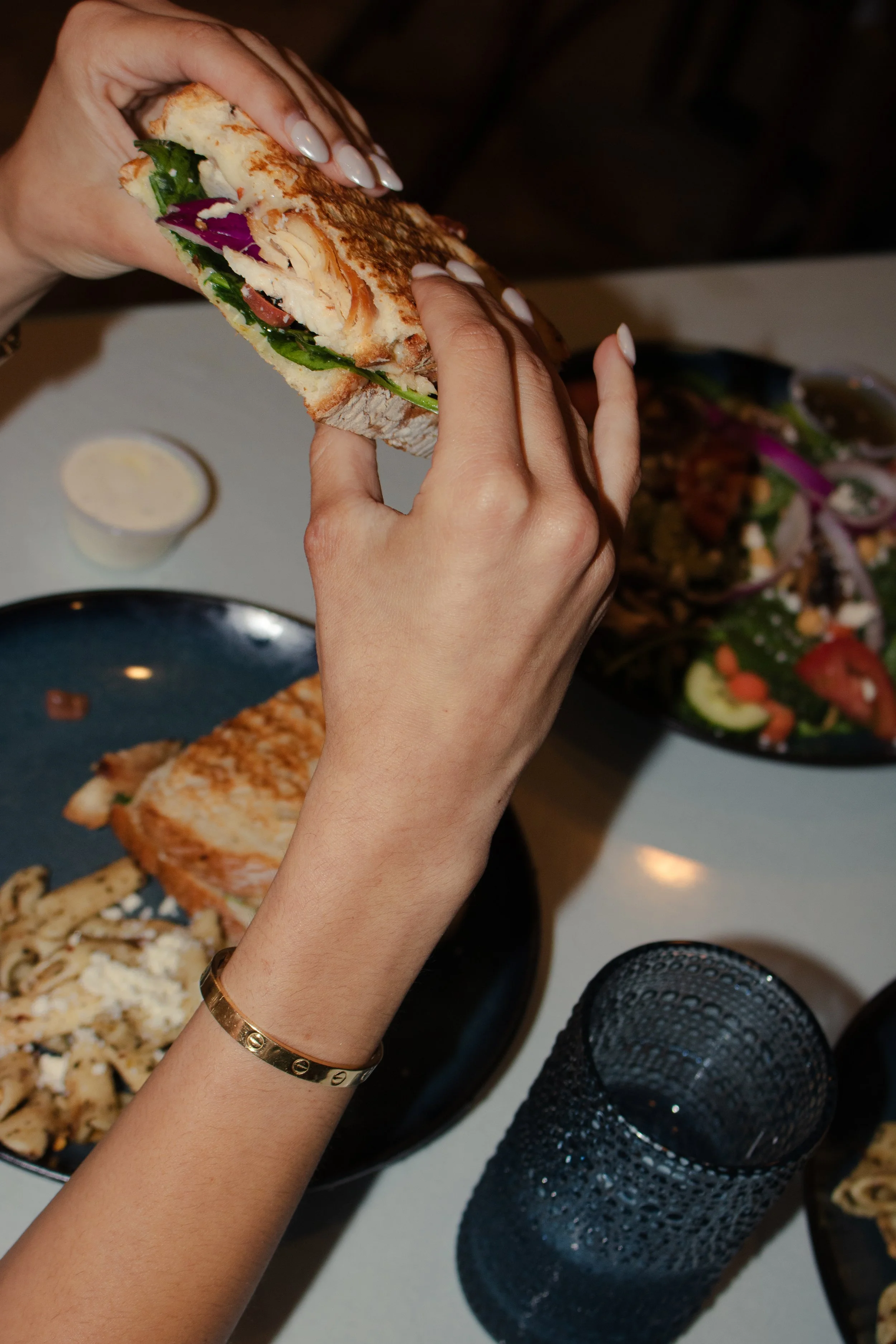
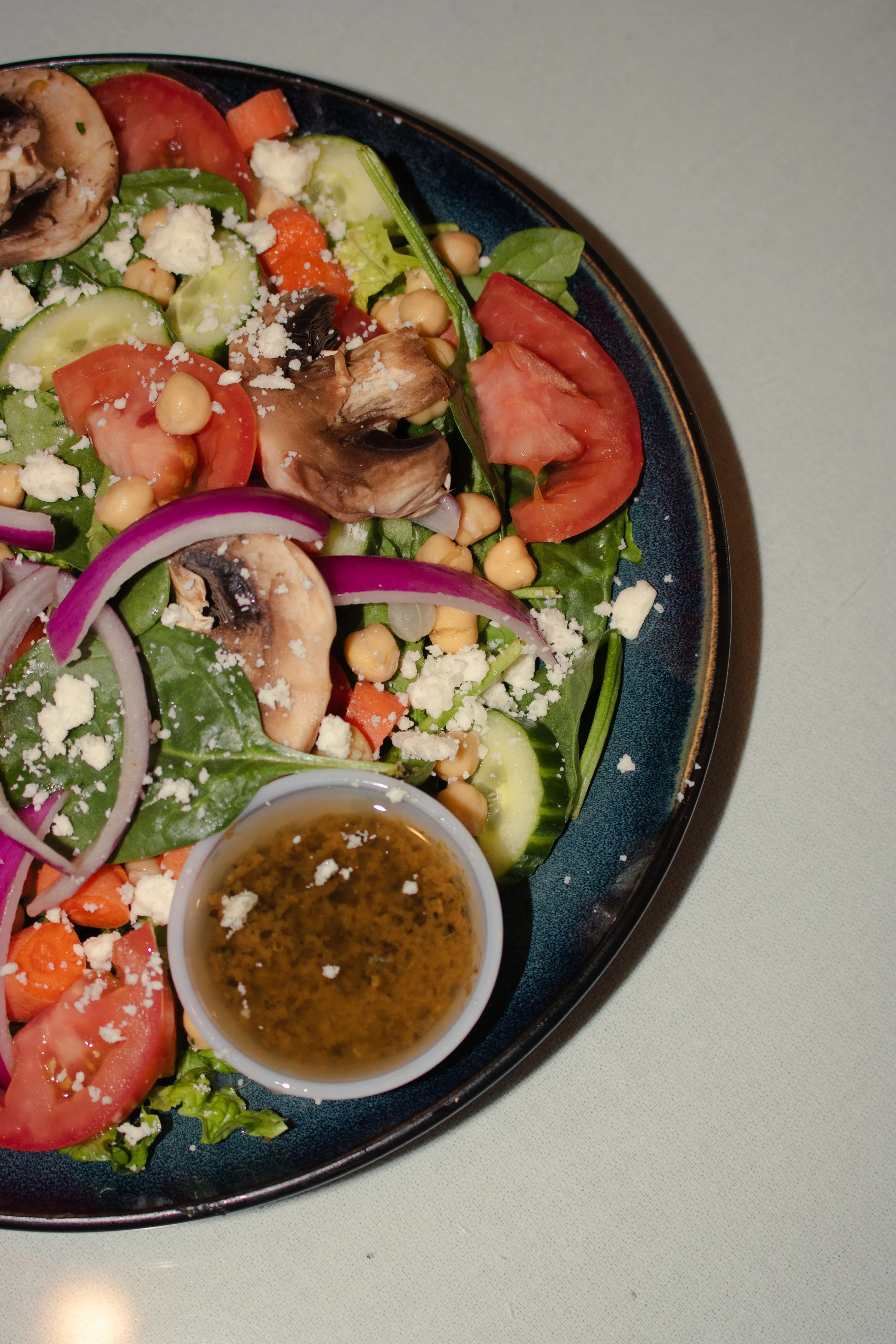
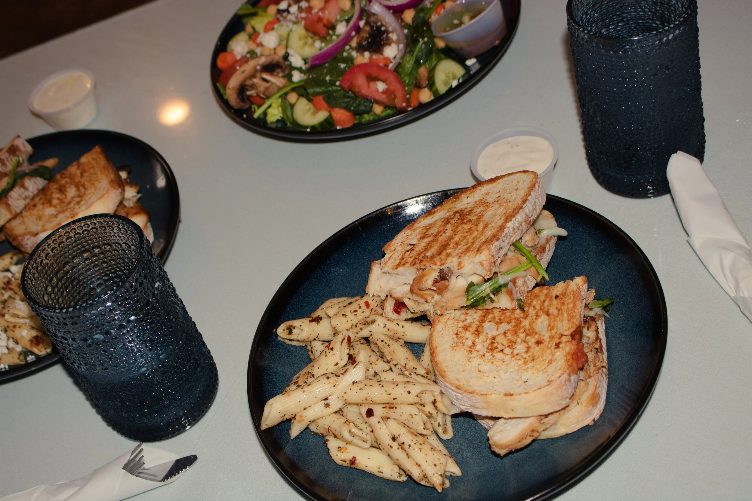
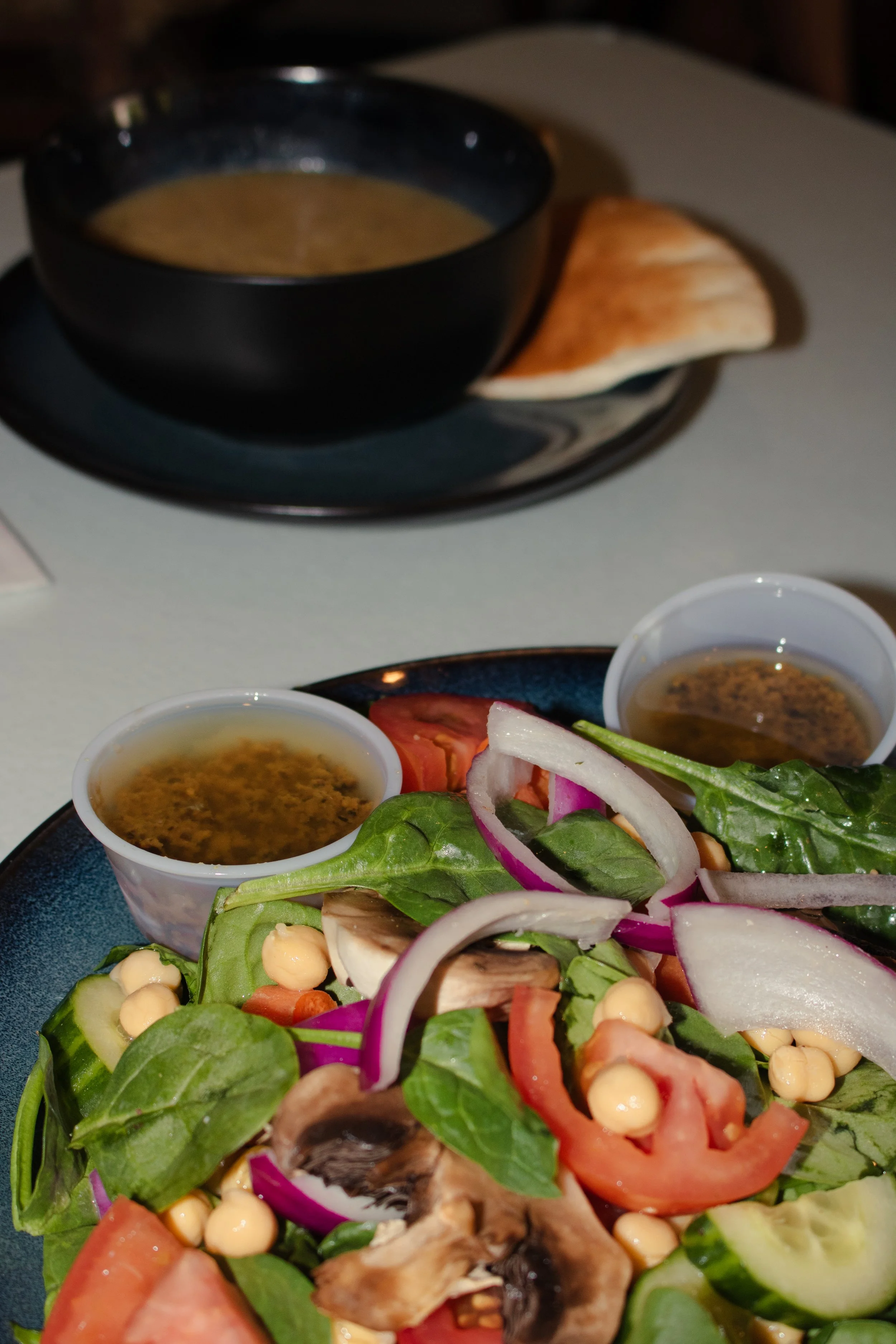
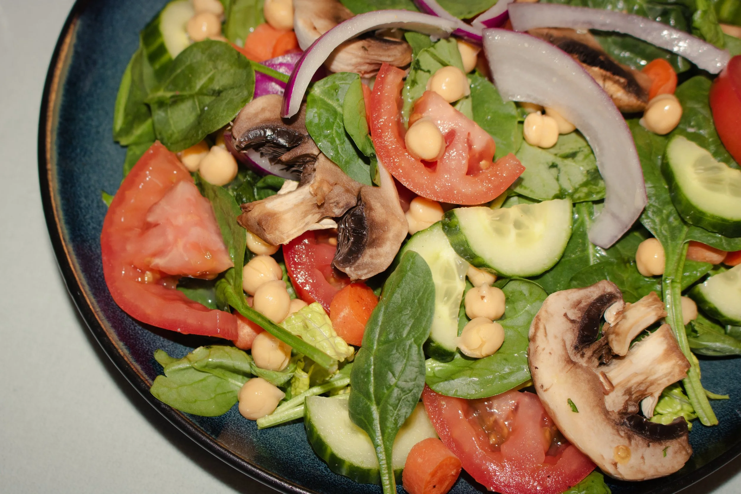
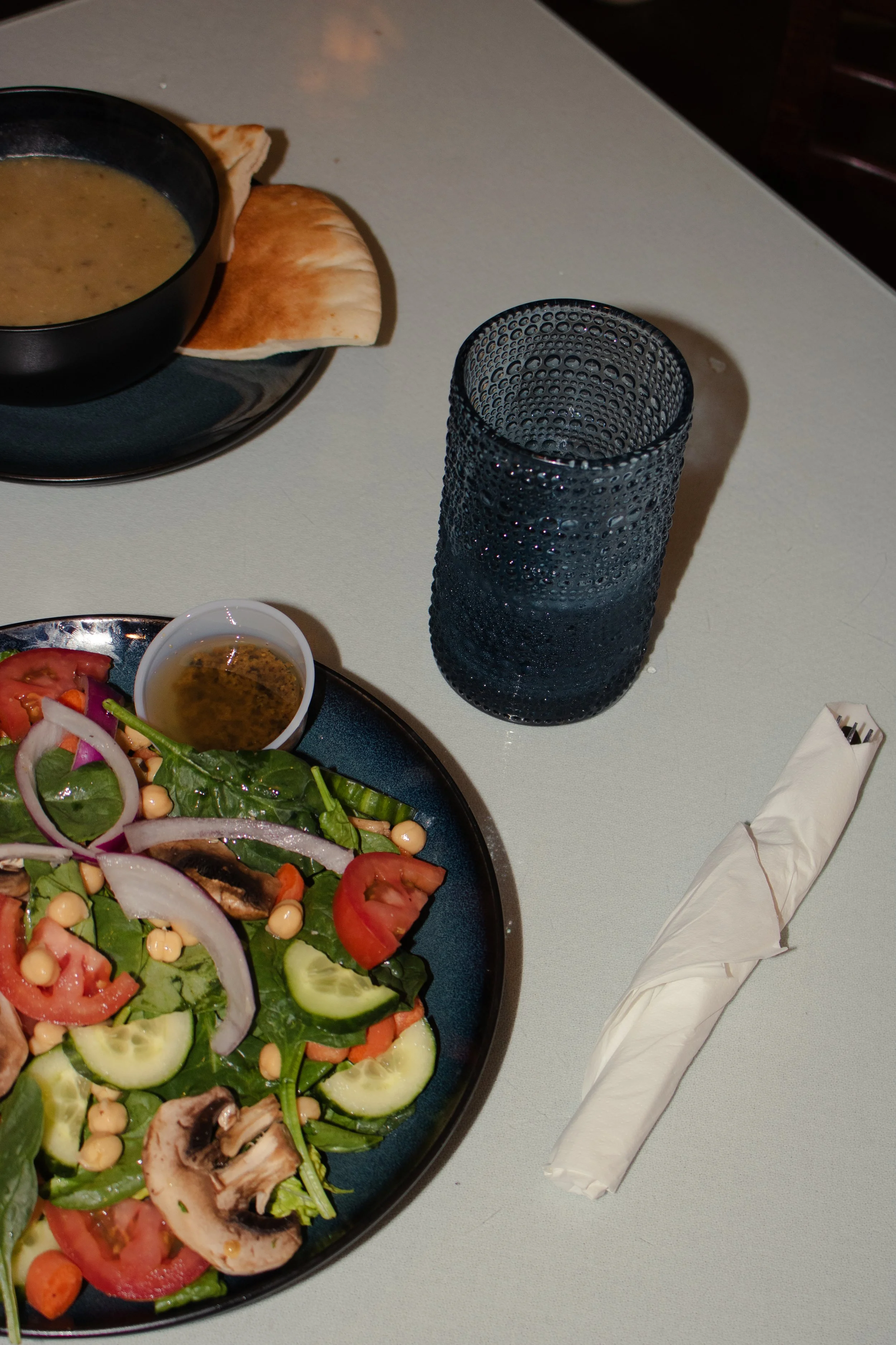
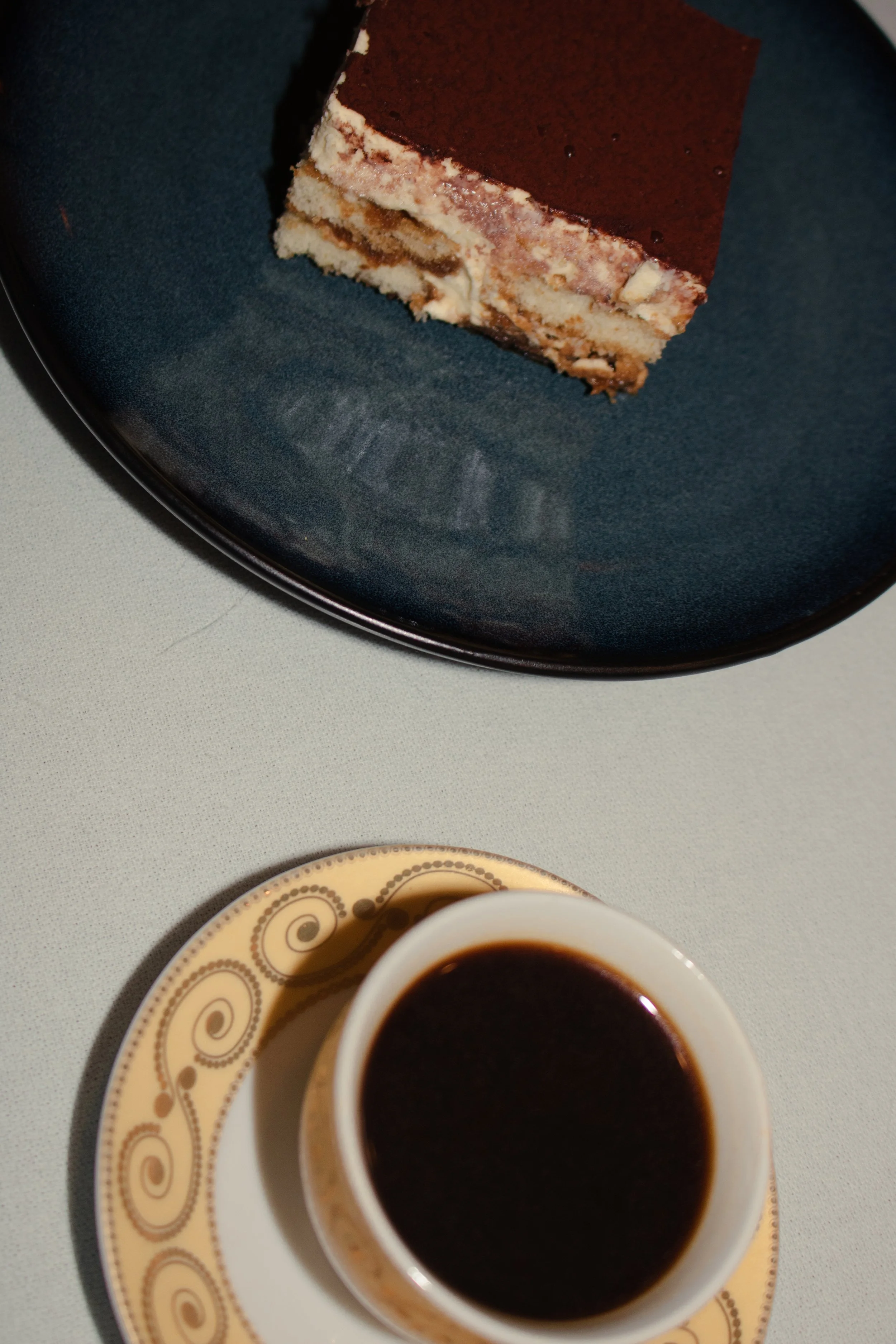
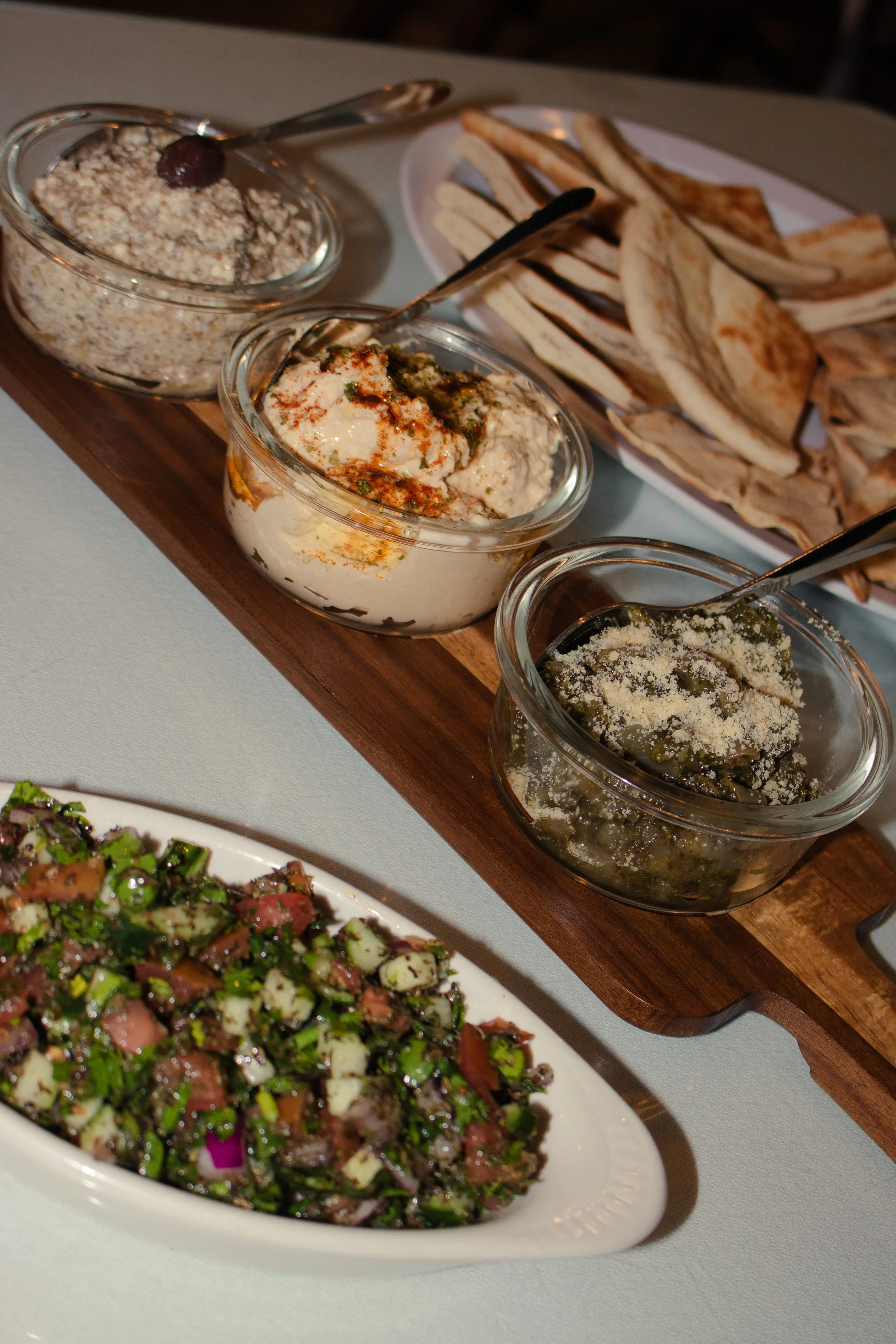
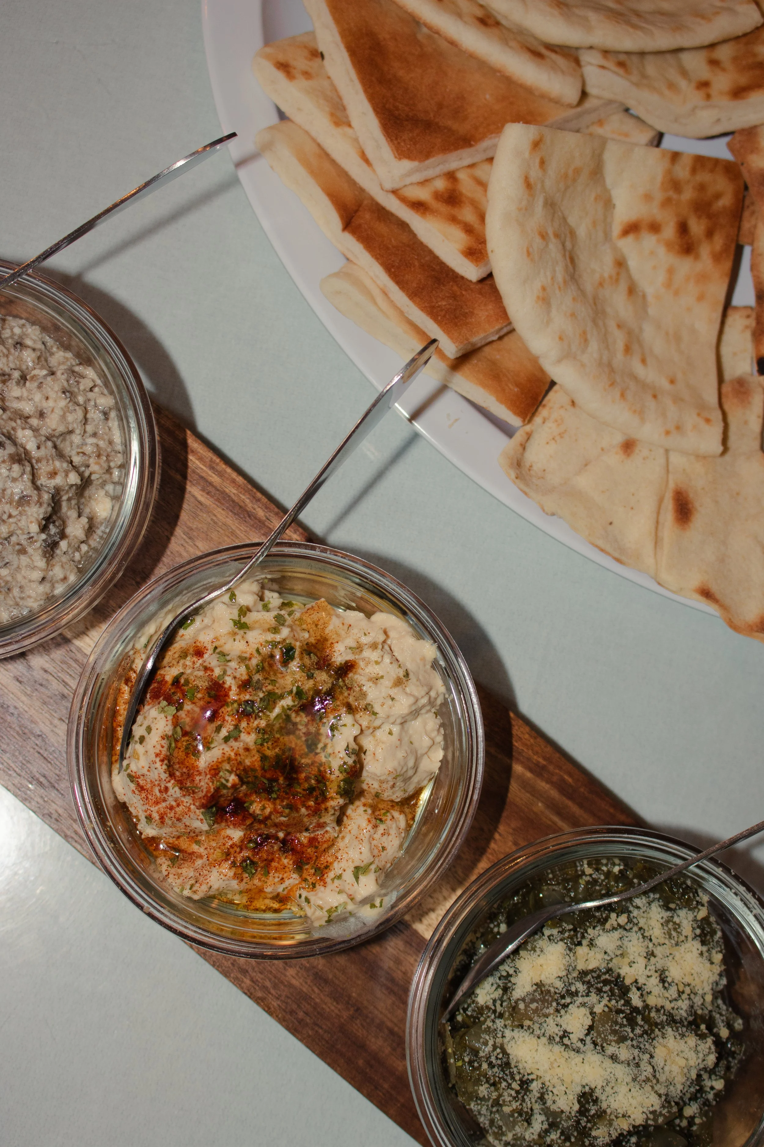
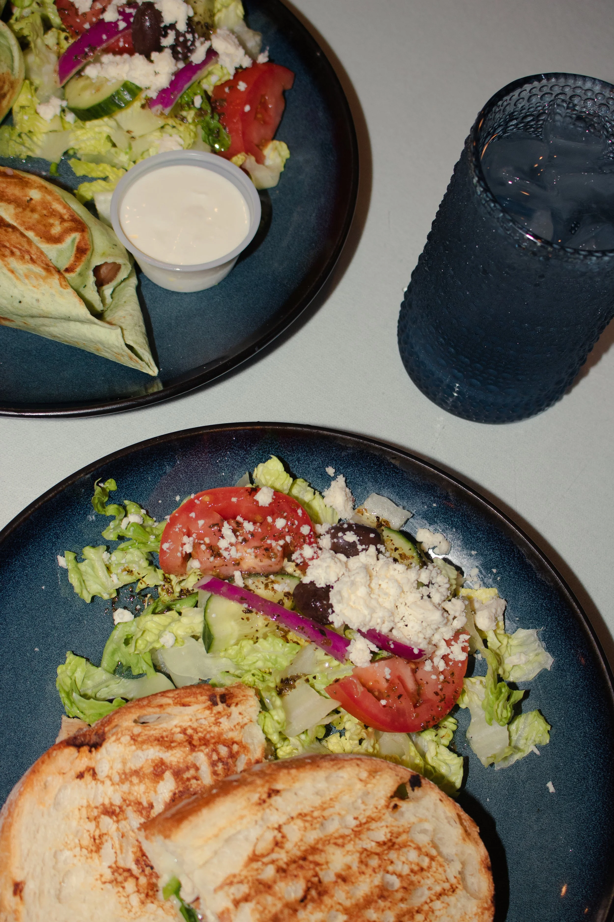
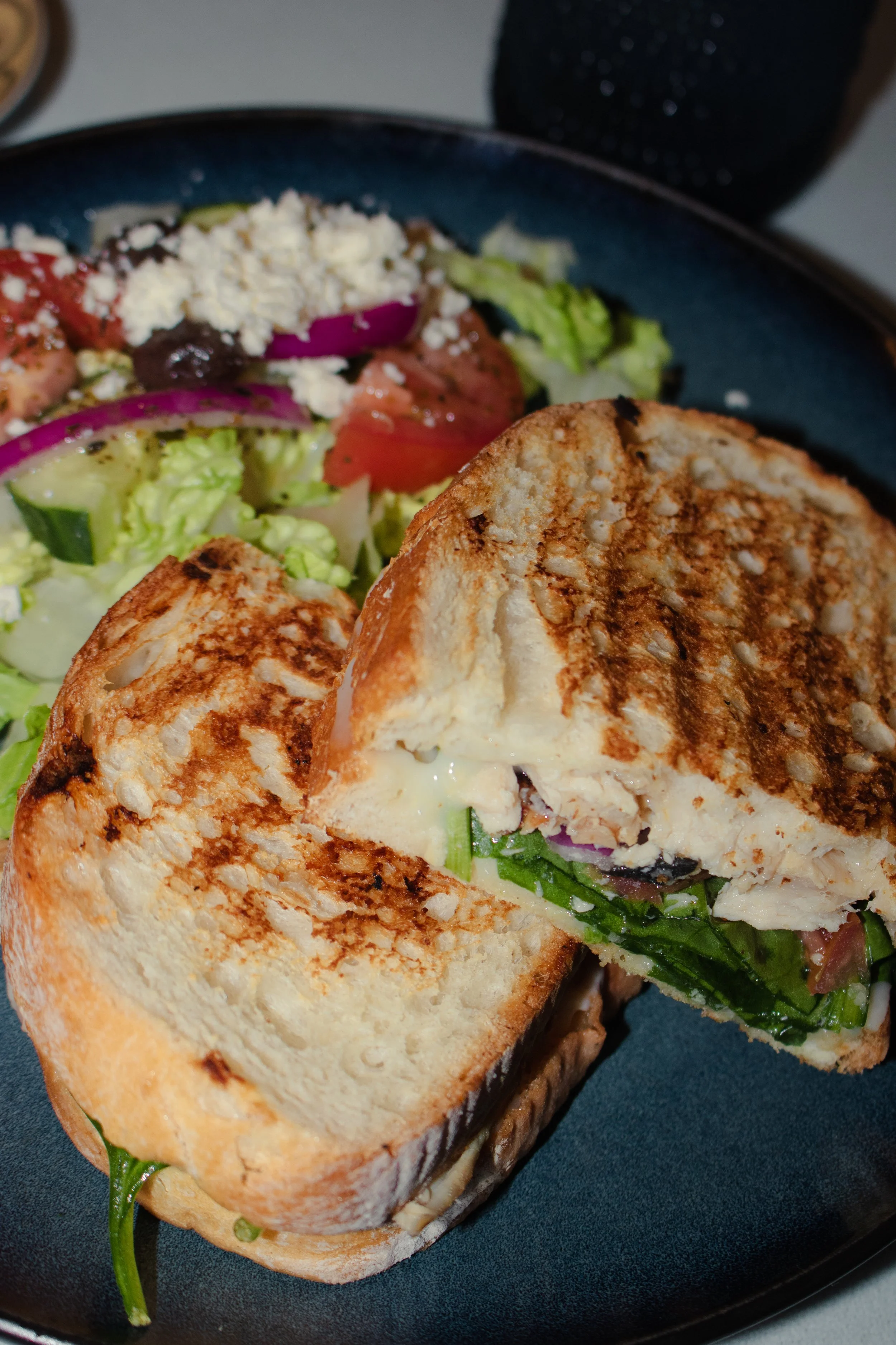
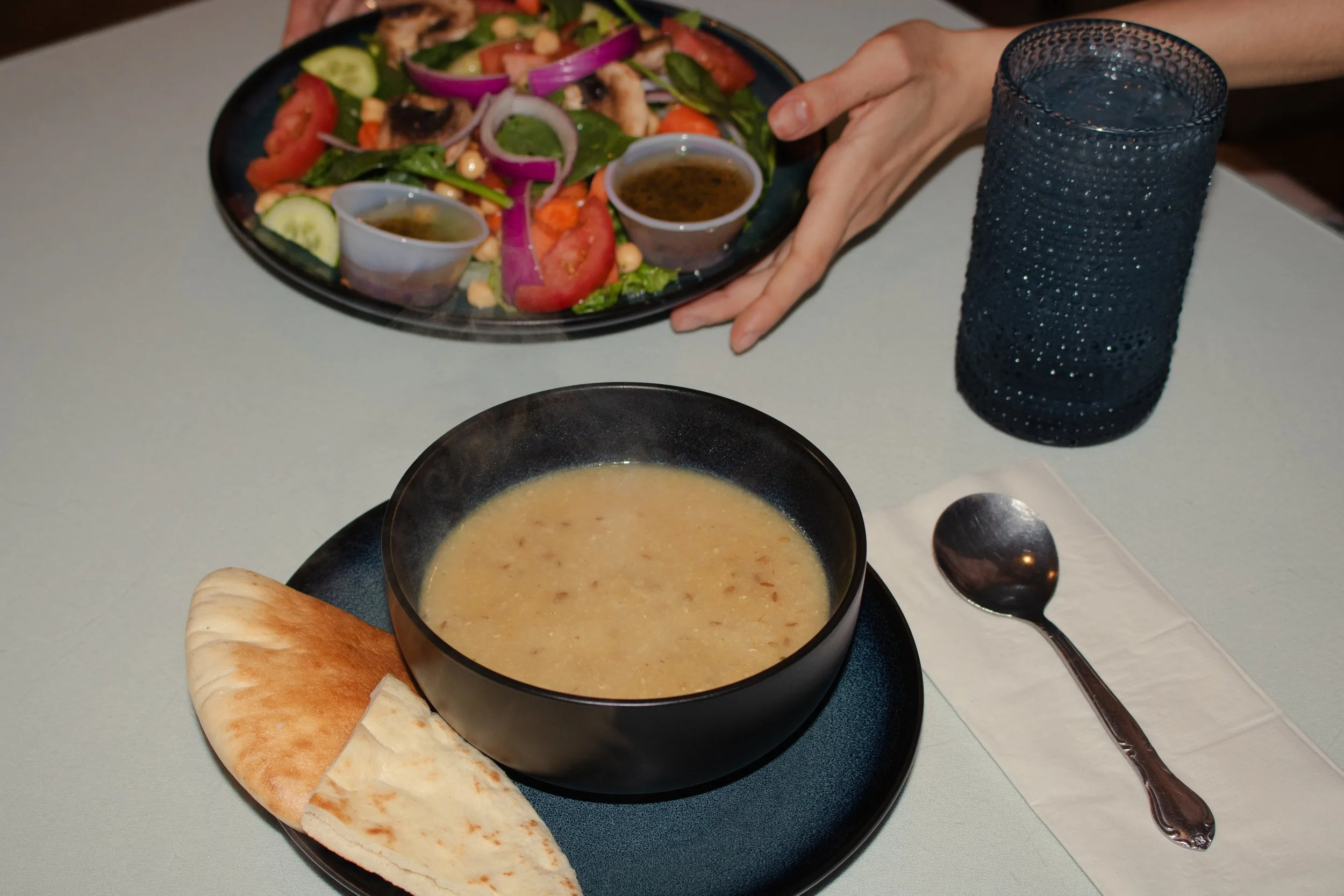
To go with the new brand, original food photos was taken that focused on freshness, texture, and color. The photos and design work together to make a brand image that is complete and appeals to all senses.