
Mike’s Dogs Restaurant
Reminiscences of the age of King Kong toys, comics, and Americana served as inspiration for Mike's Dogs' rebranding. A daring, adventurous vibe was intended to define all aspects of the design, from the logo to the goods. The theme storytelling and interior design of the restaurant are brought together by the brand identity's color scheme of orange, yellow, green, and brown. All of these elements come together to create an immersive dining experience that is based on pop culture and nostalgia.
STRATEGY
IDENTITY
MERCHANDISE
ENVIRONMENT / SIGNAGE

A bold sans serif font that looks like King Kong's famous lettering style was used to make the design in Adobe Illustrator. Its heavy, block-like structure gives off a sense of power and effect, which fits with the restaurant's lively personality. The logo is the most important part of the brand, so it shows up clearly and strongly in all applications.


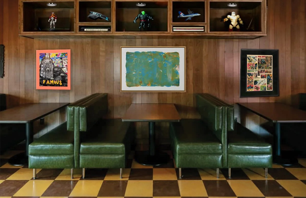
Adobe Photoshop was used to create the storefront and interior concept. AI-assisted tools were used as part of an evolving design process. The environment has wood-paneled walls, green booth seating, and yellow and orange accents that go with the brand's nostalgic color scheme. All of these things work together to make a lively space that pulls guests into the fun, comic-inspired world of Mike's Dogs.
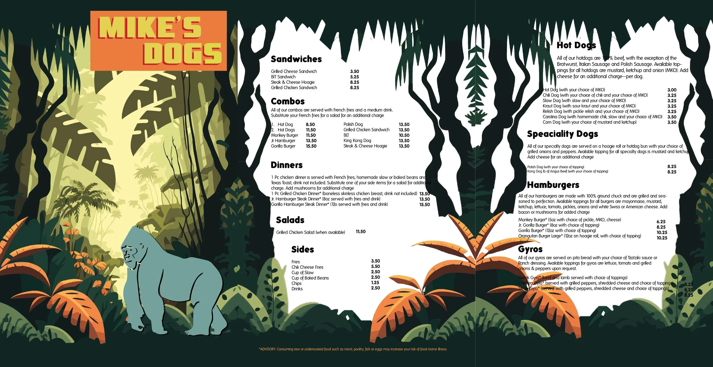
The menu was made in Adobe Illustrator with a style that was influenced by King Kong stories and wild adventures. The established color palette, big fonts, and themed images all work together to make a menu that is both useful and on-brand, drawing customers into the restaurant's story.
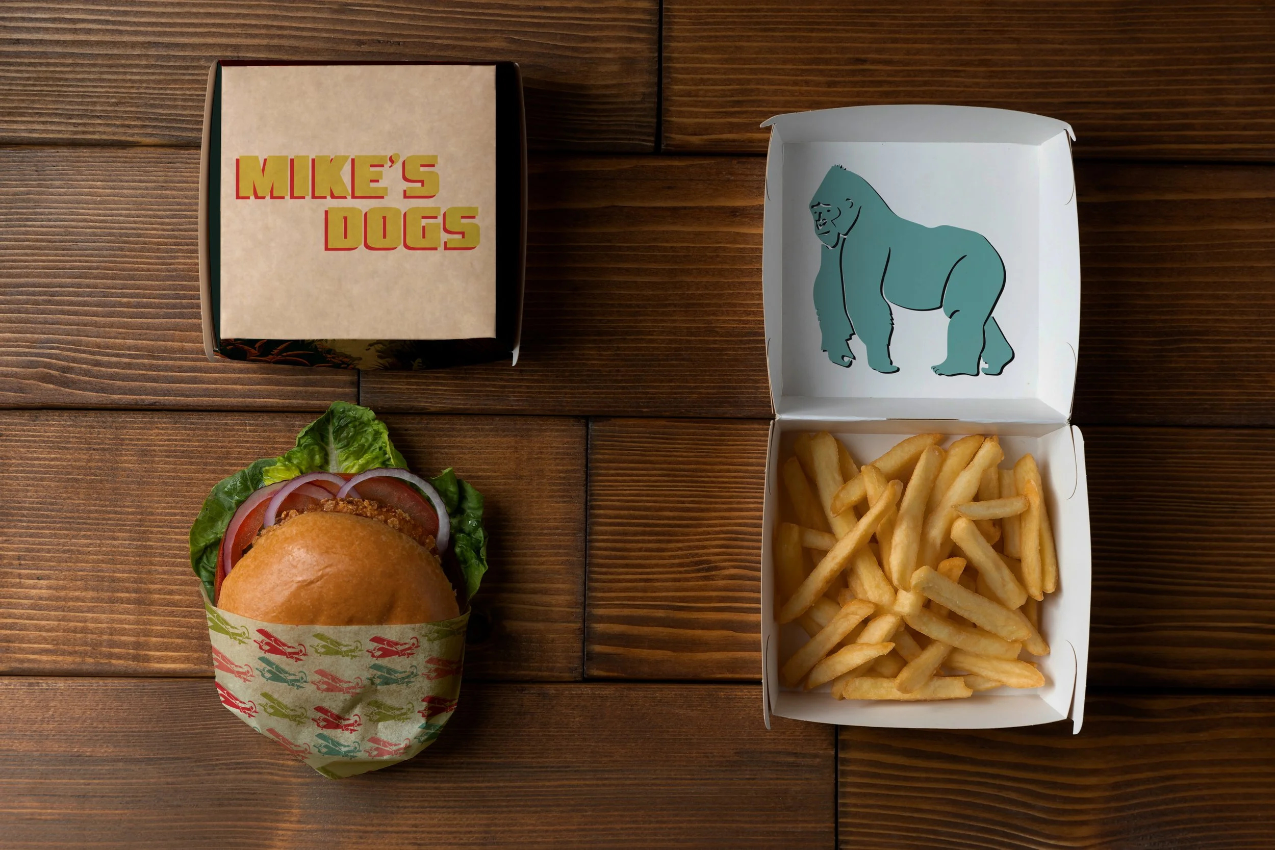
The airplane design on the packaging is a reference to the famous story of King Kong and gives the products a unique look. When used regularly on takeout materials, the design builds brand recognition and puts the restaurant's story into the hands of the customer.


The merchandise was made to keep people interested in the brand outside of the restaurant. A simple cap with the logo draws attention to the brand, while a t-shirt with an airplane pattern on the back and the logo on the front strikes a good mix between subtlety and storytelling. These things add another way for customers to see your business and connect with you.