Castings Literary Arts Magazine
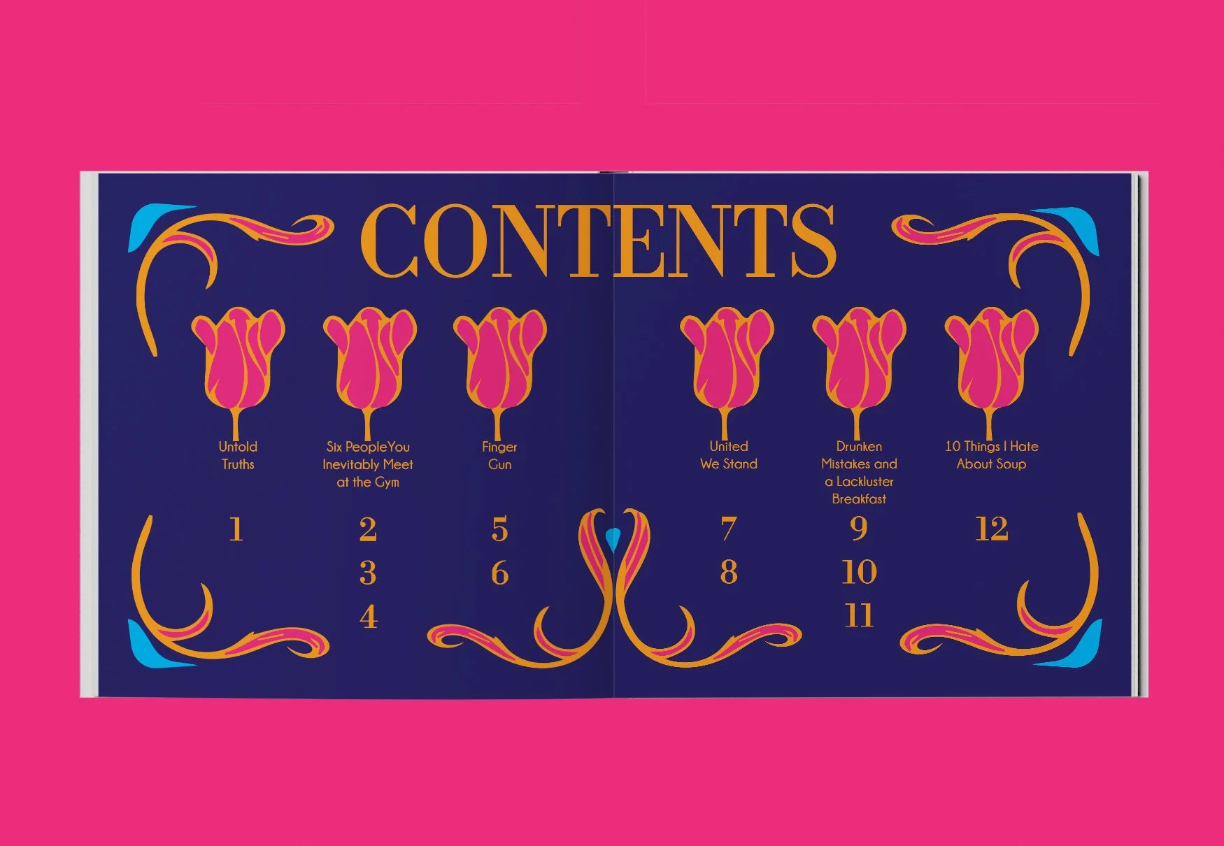
Drawing from the Art Nouveau style, this literary arts magazine design was made in Adobe InDesign and Illustrator. The project is all about style and structure. It uses an 8x8 grid, organic flower illustrations, and a vibrant color scheme of orange, pink, and blue. When put together, these parts make a magazine that is both influenced by history and executed in a modern way.
STRATEGY
IDENTITY
DIGITAL

The custom flower pattern on the front and back covers is based on Art Nouveau designs. The design keeps the overall look consistent and reinforces the magazine's style. The covers are both the beginning and end of the publication, giving the material a consistent look.
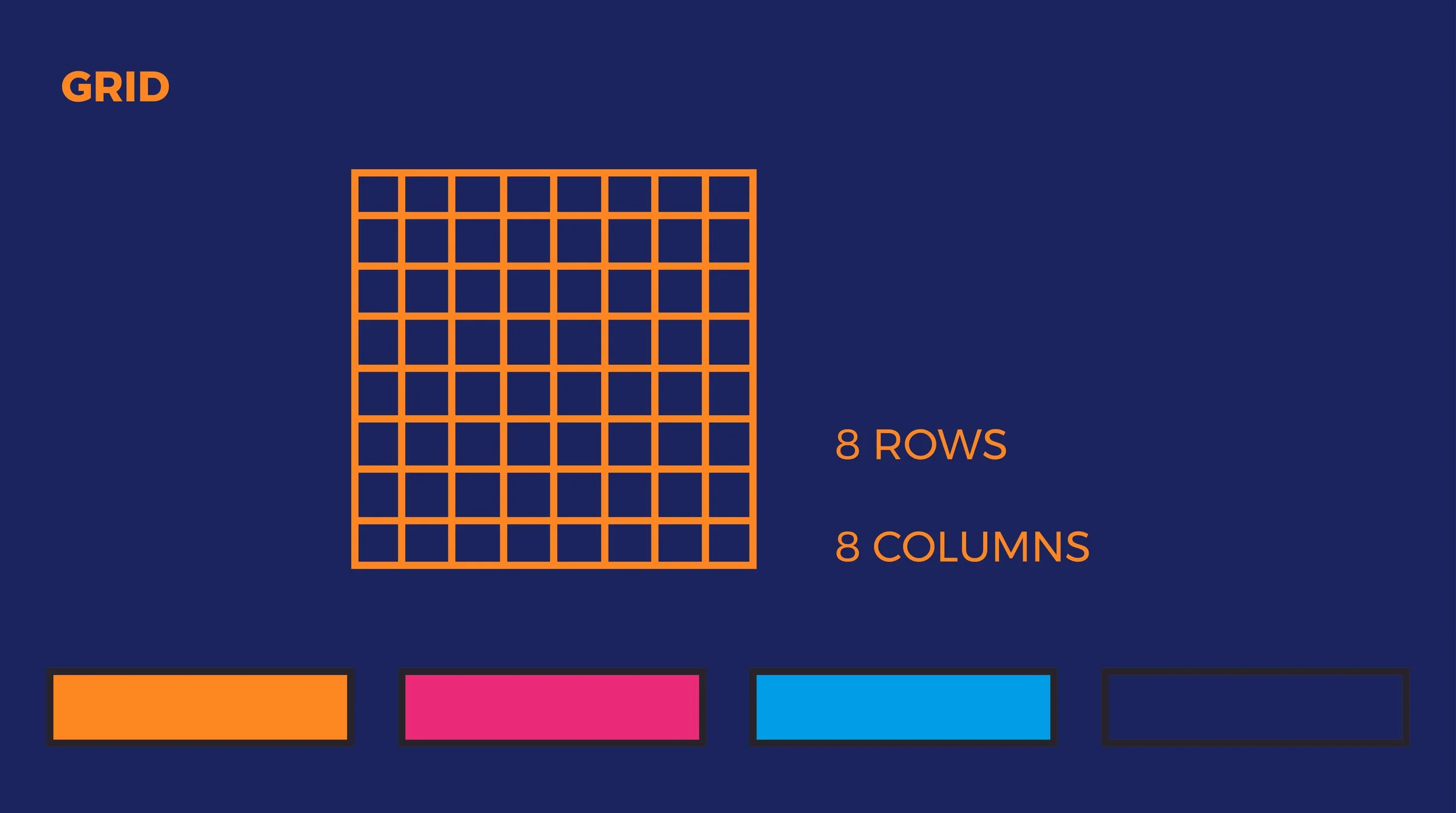
An 8x8 grid was used to organize the layout. This framework lets you be flexible with where you put information while keeping the visual order. The color scheme of blue, pink, and orange was chosen to make people feel lively and energetic, and it goes well with both the floral images and the typefaces.

The given serif logo helped with the font choices. To keep things consistent, a clean sans serif was paired with a complementary serif. This gave the whole magazine structure and contrast. This typeface system combines classic style with current ease of reading.


The magazine's brand is spread across both paper and digital platforms by promotional materials like an Instagram post and a poster.