
The Taco Shed Restaurant
The rebranding of The Taco Shed was intended with the fact that it is close to an Air Force base. To connect the restaurant's brand with its main audiences, Adobe Illustrator was used to make taco airplane illustrations that were used in all brand elements. The visual system combines fun and useful elements in everything from logos and packaging to signs, merchandise, and menus, making sure that the eating experience is cohesive and memorable.
STRATEGY
IDENTITY
MERCHANDISE
ENVIRONMENT / SIGNAGE

A versatile brand system was made by making several variations of the logo and putting them on stickers. These stickers are both promotional items and visual accents that help people remember the brand at different places of engagement.

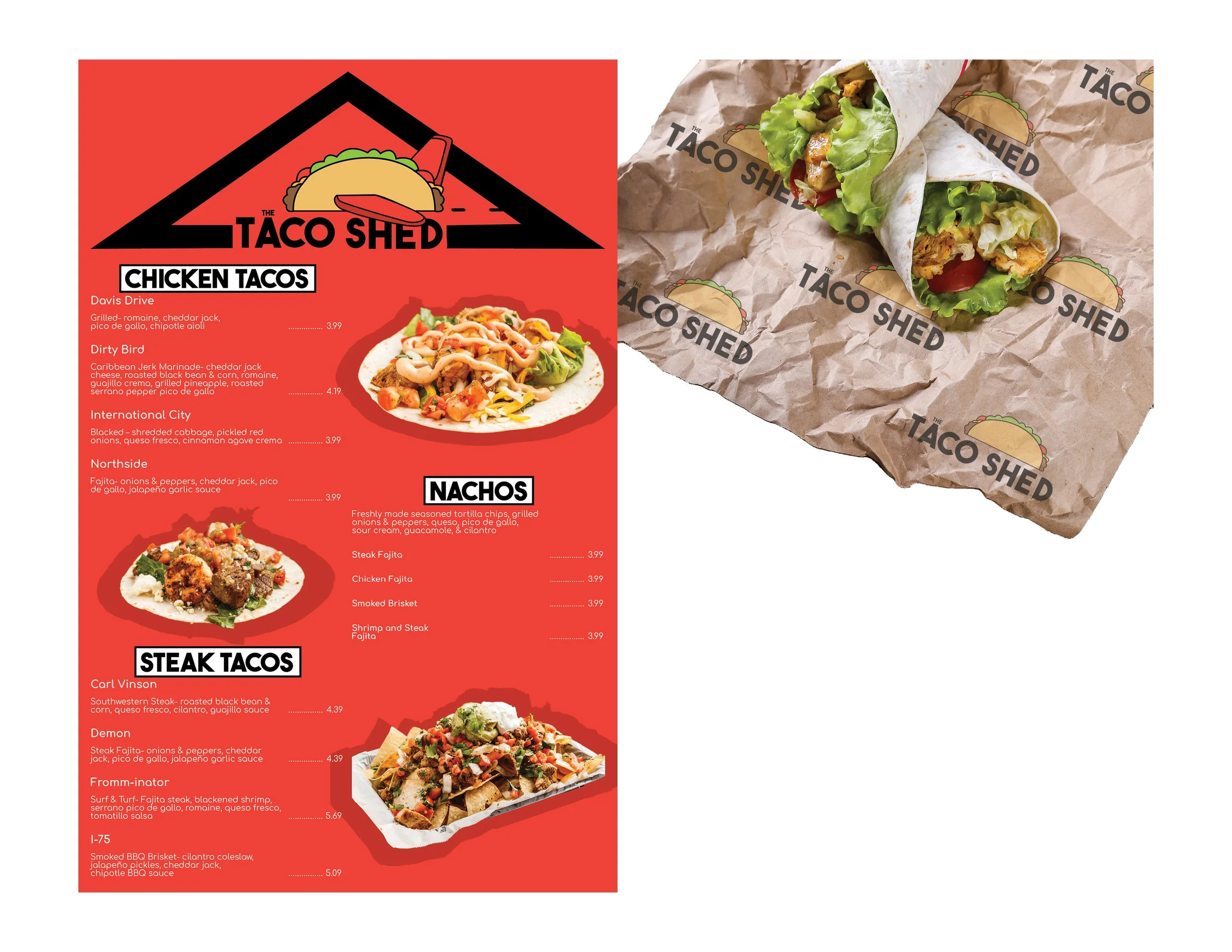

The brand strategy is used on menus, signs, drinks, and paper liners, all of which are important parts of a restaurant. To keep the brand's identity consistent, each piece uses different logos, food photos, and fun taco airplane illustrations. From placing an order at the counter to enjoying their food, they work together to give customers a consistent and interesting experience.


The merchandise collection was made to help the restaurant reach more people and connect with more customers. The clothing has the taco airplane and name on the front, and a bigger logo on the back to make it stand out. This makes a strong, practical impression of the brand.